Improving brand image with an immersive landing page | Movella
The client was using a default template from Hubspot before we started with this project. It was completely static and it did not make them stand out as a company. At that time interactive 3D elements on the web were an emerging trend and we decided to integrate this trend into their landing pages and in this way increase conversion rates. .

Promote the new sensor of Xsens while presenting Xsens as an innovative and modern brand.

Firstly I had to decide on the technology we will use in order to bring the ‘3D’ and immersive look to the landing pages. This required a decision matrix. This project followed an iterative design process where multiple meetings with the client took place to define the requirements for the page and the initial design. Afterwards the page was usability tested and improved before launch.

One useful way of differentiating between the different explanation needs is based on the types of questions users might want to ask the model.
In the domain of context-aware computing, the following types of questions are defined:
Input, Output, What, Why, Why Not, How, What If, How to, and Certainty


With the client, we had already agreed to utalize 3Danimations within the landing page in order to present XSENS as a more innovative company. I thought of 2different ways of doing that - placing actual 3D objects on the page with the use of a javascript library or using a rendered 3D animation video as a background and attaching the mouse scroll interaction to its timeline. In order to make the right decision a decision matrix was utilised. It was based on 5 factors and each factor had a different weight - render quality, interaction possibilities, time efficiency, loading time, complexity.
The overall result out of the matrix was:
Three JS - 63 points
Video scroll - 71 points
Therefore the scroll-through video was concluded to be the better option for this project.


I met with the client and discussed their goals with this landing page, which was the leading factor for what would be placed on the page. The content we decided on can be seen on the image below.
Illustrations of Rotterdam hotspots to be used in promotional materials about living in Rotterdam.
Tools:
Illustrator

The first version of the responsive high-fidelity design was created in AdobeXD. The wireframe stage was skipped due to the limited time we had before the launch date. The designs can be seen below.
During the same time, the 3D animations created for the page were reviewed with the client. They were later adjusted to reveal less about the contents of the sensor.

Low-fi prototype
Improvements
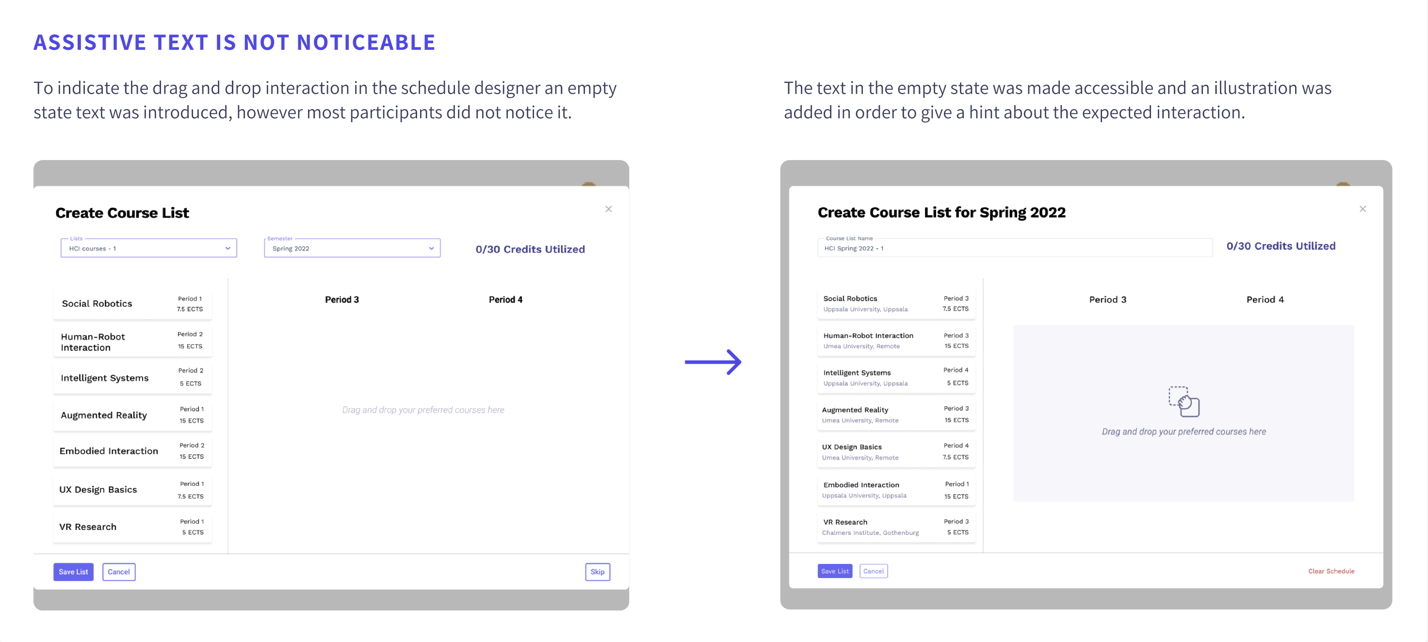
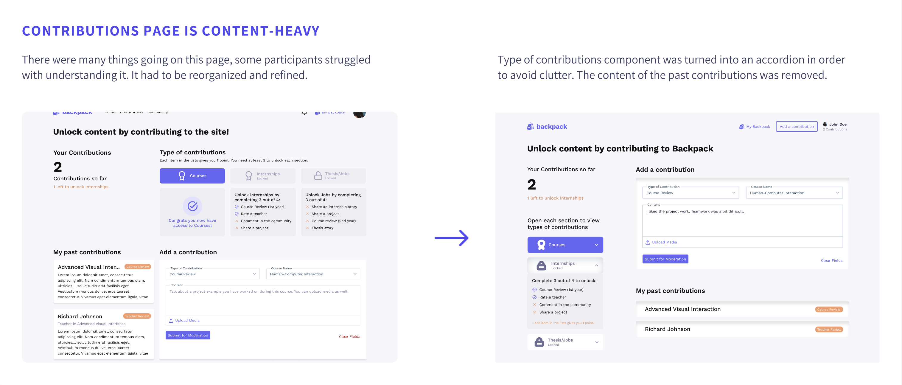
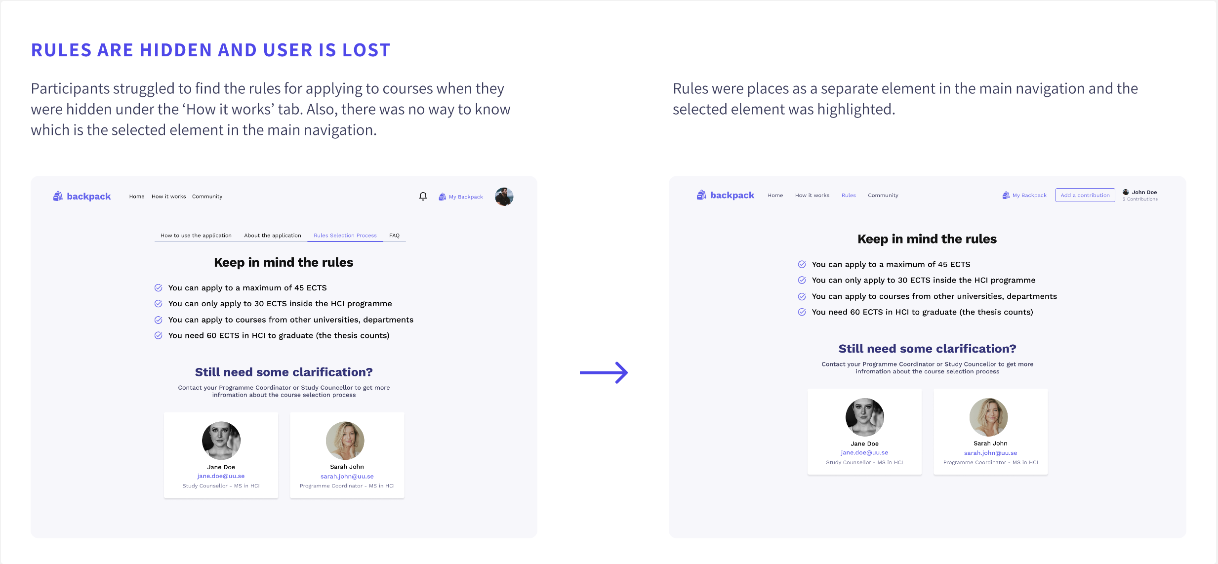
4 usability tests were conducted to evaluate the first prototype’s usability and clarity.
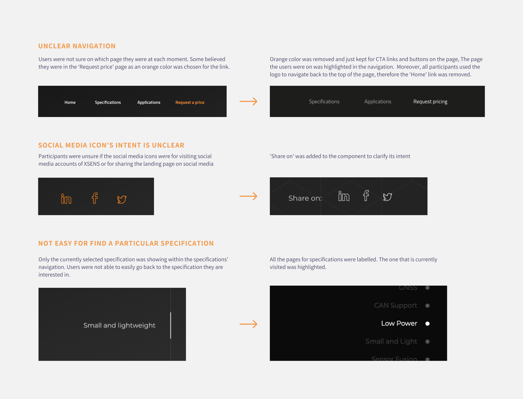
Afterwards, the prototype was improved based on the findings. Some of the issues spotted during the usability tests are described below together with their improvements.
A simple design system was created to ensure consistency and speed up the high-fidelity design process.
You can access the design system from here.
The final high-fidelity designed prototype can be accessed at this link: Or please watch the video below.
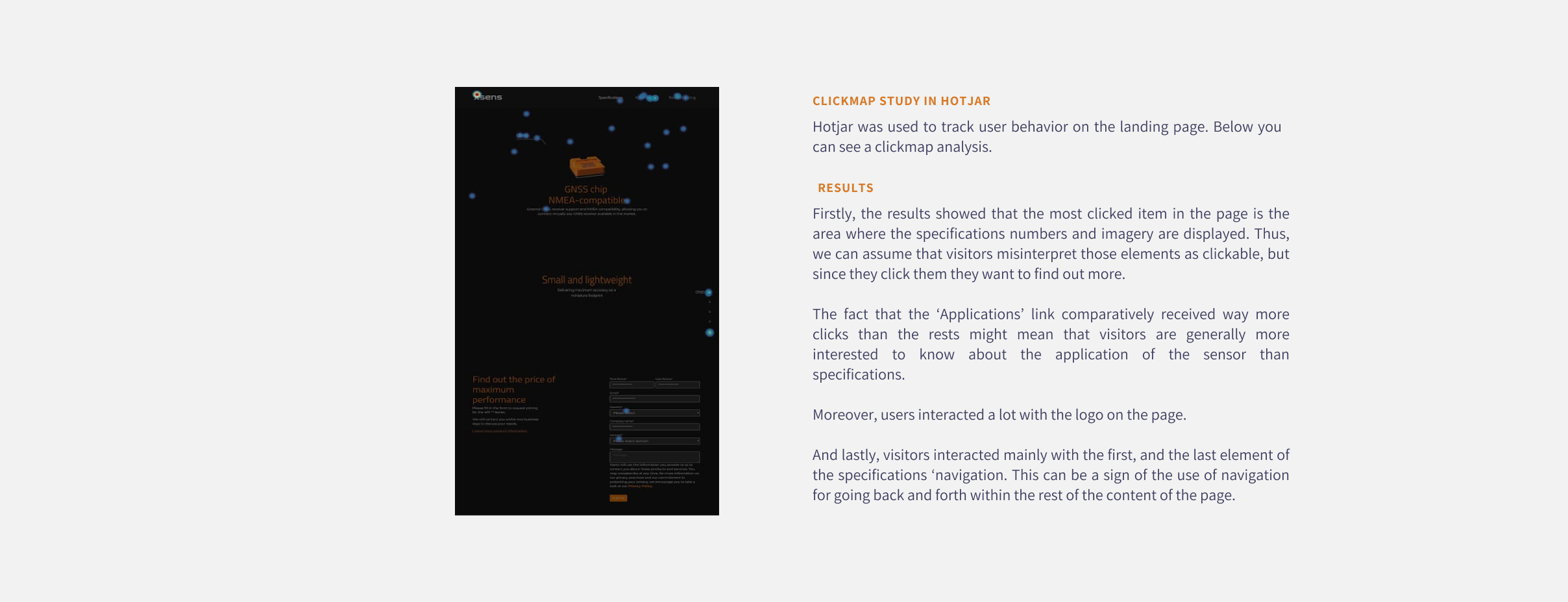
Once the web page was live click map and heatmap analysis could be made as all animations were now running smoothly and all interactions worked as expected.
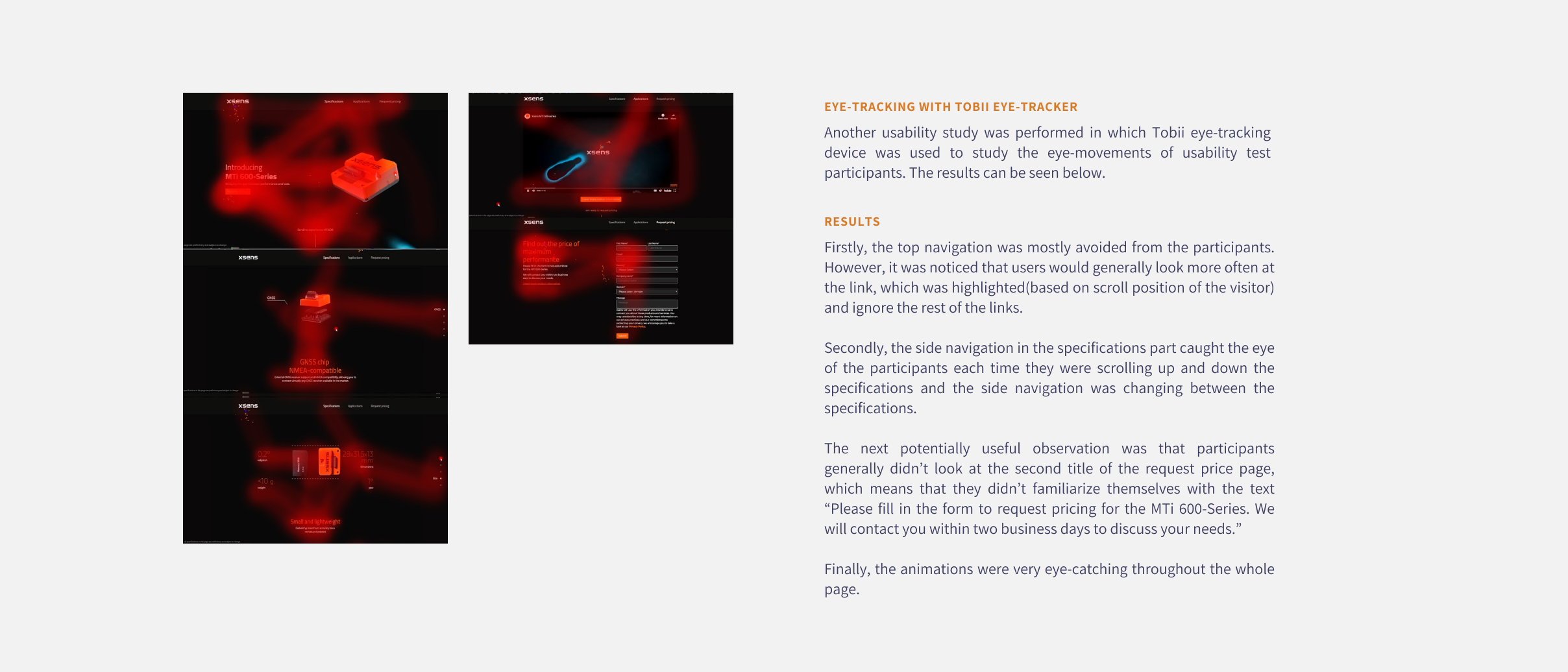
Tobii eye tracker was used in another set of user tests in order to be find out which elements on the page attract the most attention and which are missed and see if we could use this information to optimise the page further in the future. A heatmap was generated based on the results.
Moreover, a clickmap was extracted from Hotjar which showed us where do users clicked the most on the live page.
Usual scenario
Unsual scenario
Improvements were made based on the major issues found during the usability tests. Some are mentioned below.