The Smart Climbing Planner is an idea for improving an existing application used to control the climbing wall at my climbing gym.
The tasks that the system can currently help with are:
- find out which are the new routes at the gym
- turn on and turn off the routes
- see the grades of the routes
- mark that you have completed a route and
- grade how much you like the route.
I believe this app can be transformed from a tool to an agent, which will enhance the experience of climbers and put them in control. It will reduce the information work that climbers have to do that can be delegated to the agent.

Be able to improve as a climber quicker and have more productive climbing sessions overall.

The way to achieve the goal was by spotting the negative aspects of the current user journey, and identifying opportunities of how they can be improved with thedesign of a new AI agent.
One useful way of differentiating between the different explanation needs is based on the types of questions users might want to ask the model.
In the domain of context-aware computing, the following types of questions are defined:
Input, Output, What, Why, Why Not, How, What If, How to, and Certainty


At first, a simplified Persona Map was created in order to clearly grasp what characterises the type of person who uses this app. Normally this map would be created after thorough research, but for this assignment, the findings were based on my own experience as a climber and the experiences of my fellow climbers at the gym.
This map served as the bases for the current-state CustomerJourney Map. This service design tool helped visualize the steps through which thePersona has to go through in order to achieve certain goals - 'Stay fit', 'Have fun' and most importantly 'Become a better climber'.
Moreover, the user's feelings and thoughts were clearly mapped out as well as the touchpoints of the user with devices, services and physical artifacts on each step of the journey.
Finally, some opportunities were spotted for improving the current service experience mainly based on the negative thoughts and feelings of the user. These opportunities will serve as the basis for the suggested Al and data-driven functionalities that can help improve the service experience and the future-state customer journey.
The full Customer Journey Map and the Persona Map can be seen at this link.
.png)
.png)






The opportunities defined within the Customer Journey Map were used as user requirements in this project. They helped shape the design of the agent.
Agent goal:
The agent will become the personal coach of climbers and will plan their climbing sessions and monitor their progress.
Agent tasks:
- Planning a climbing session
- Tracking the progress of the climber based on predefined goals
- Analysing climber performance
To perform these activities the agent will continuously learn from the user’s interaction with the system. It will be doing its job in the background and will be available once the user is at the climbing gym ready to be used. If the user has set the goal to train a certain number of times a week the system will send a notification to the user to remind him/her.In the following section, I have considered the UX aspects defined within the book Design of AI-powered services from Pontus Wärnestål to futher shape the agentive experience of the app.
.png)
.png)
.png)

Illustrations of Rotterdam hotspots to be used in promotional materials about living in Rotterdam.
Tools:
Illustrator

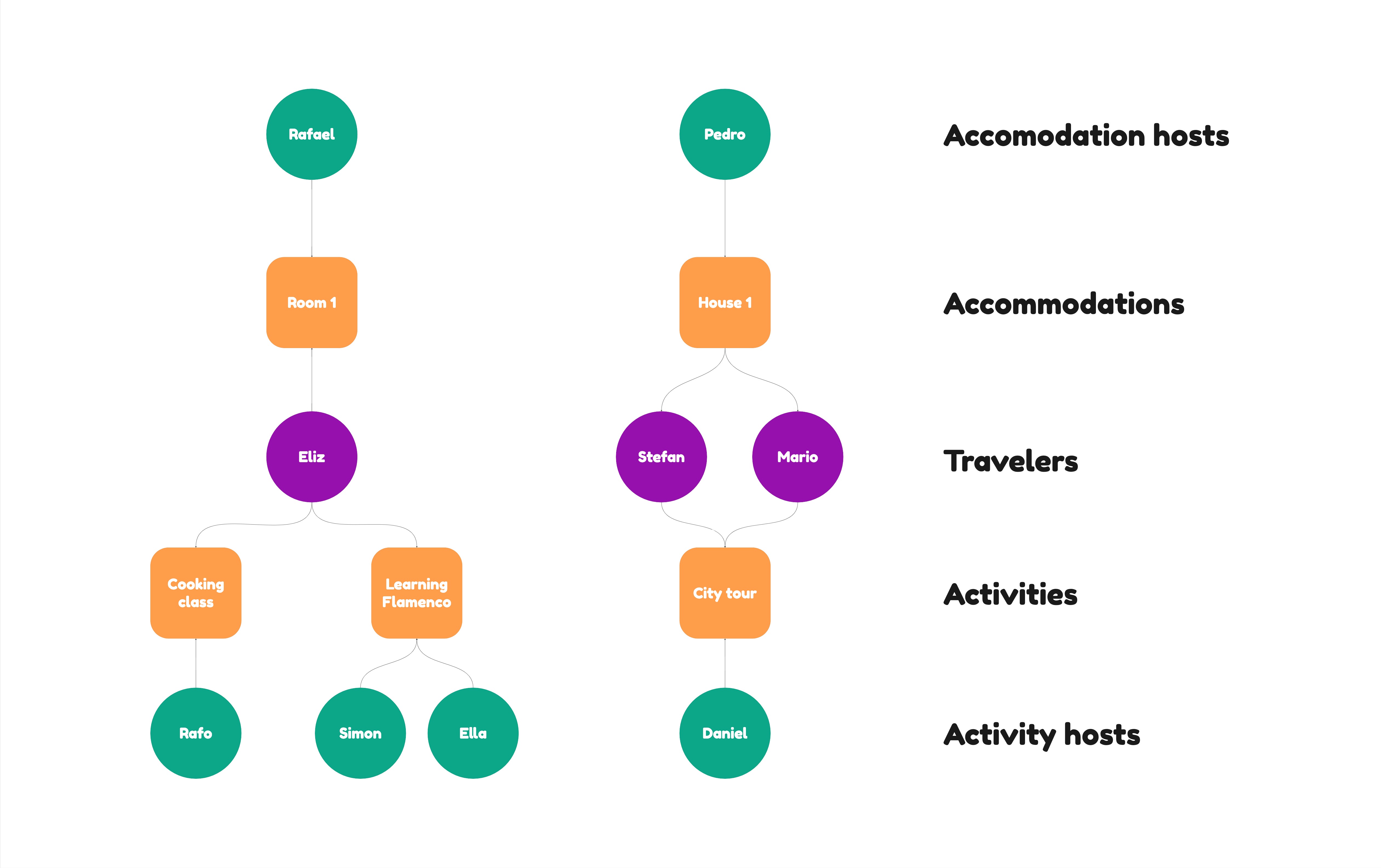
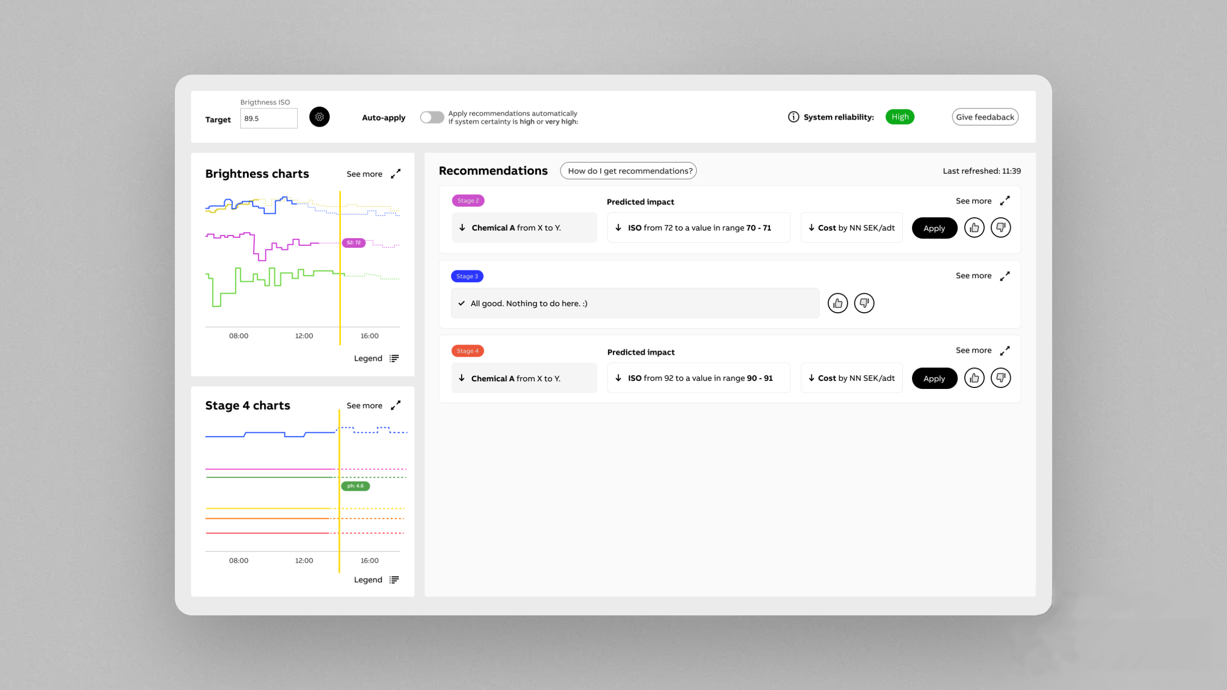
In this section, I will discuss some design principles from Amershi's 'Guidelines for Human-Al Interaction' along with how I have used them within the improved design of the E-walls app, which includes an Al agent.


Low-fi prototype
Improvements
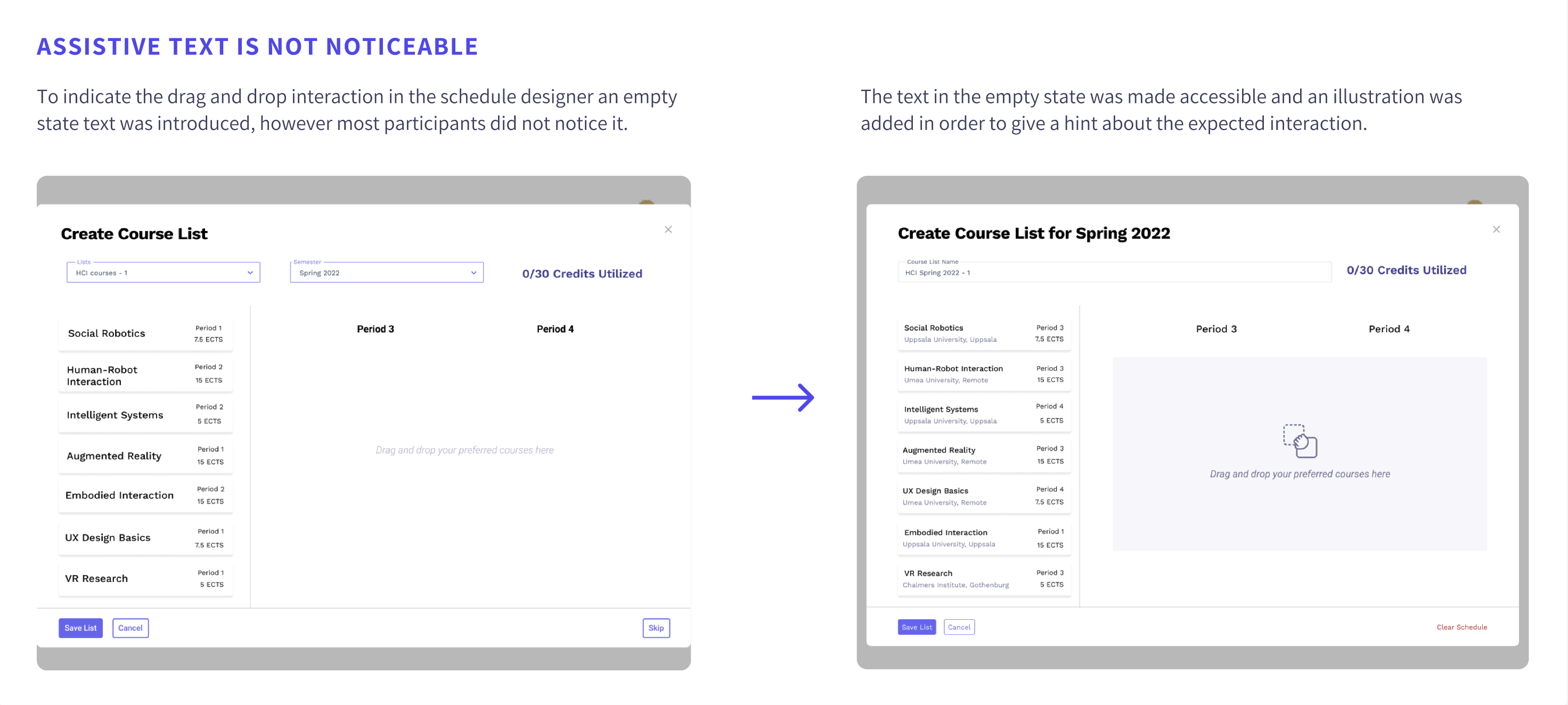
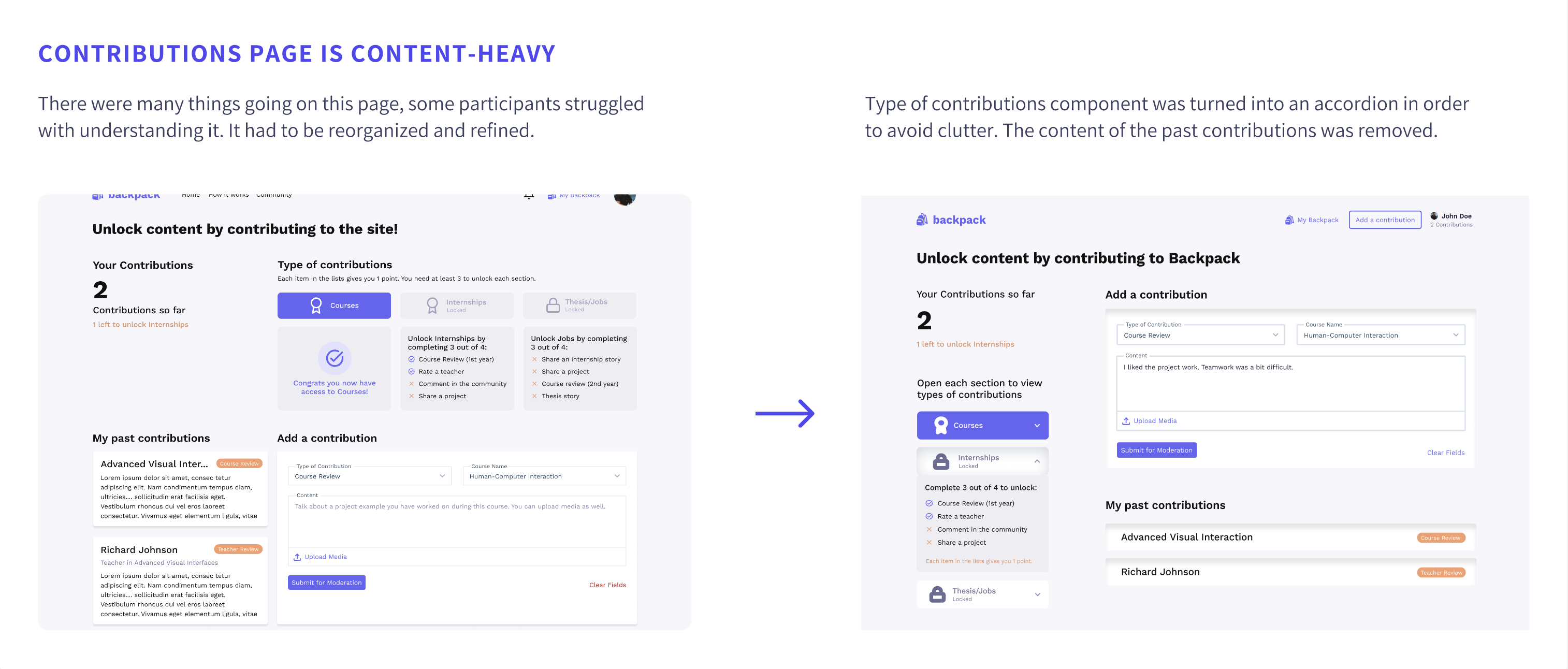
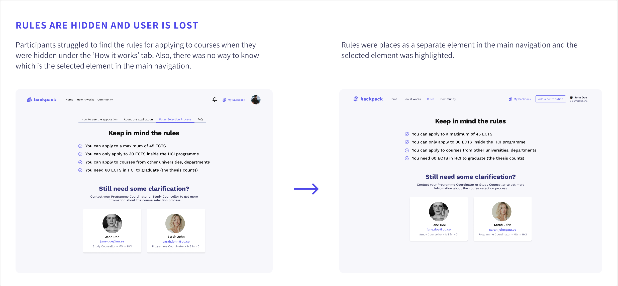
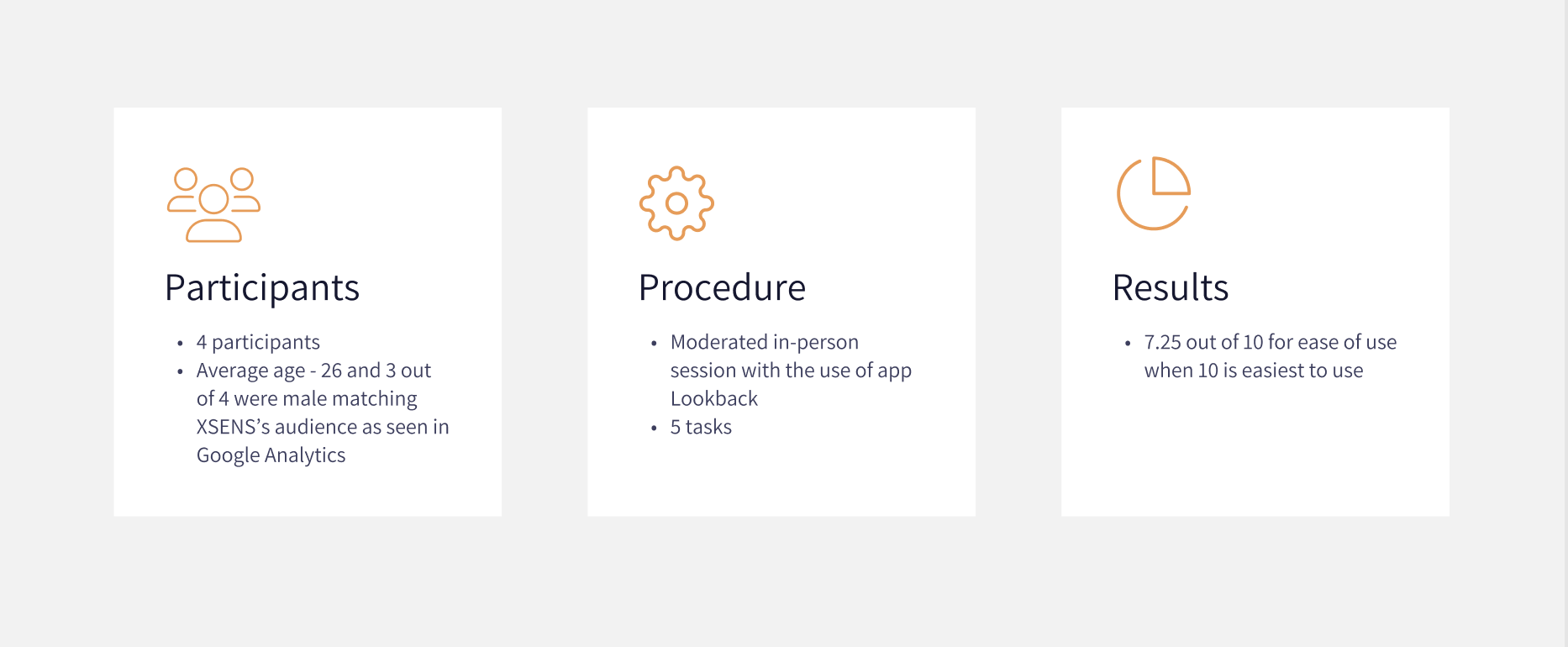
4 usability tests were conducted to evaluate the first prototype’s usability and clarity.
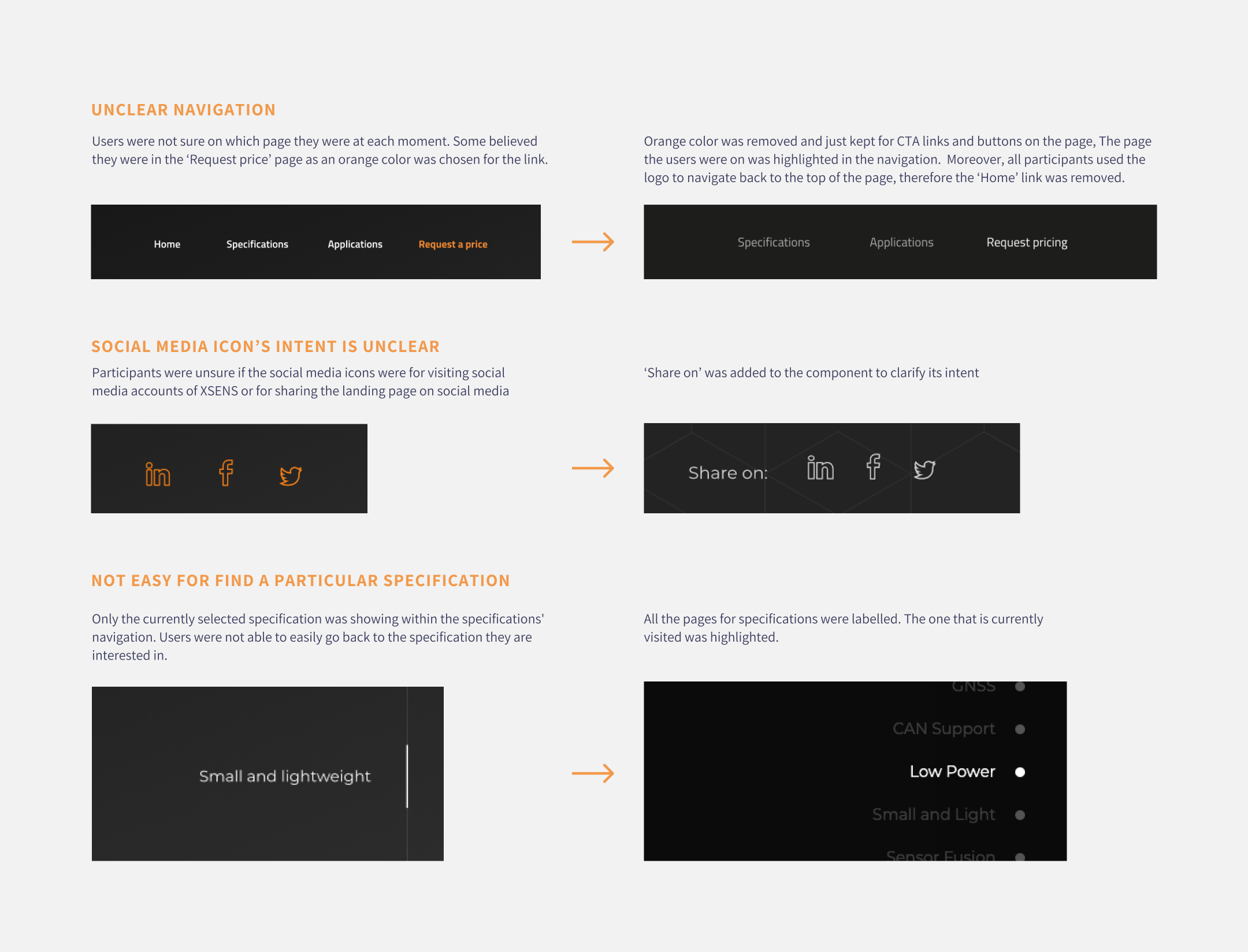
Afterwards, the prototype was improved based on the findings. Some of the issues spotted during the usability tests are described below together with their improvements.


A simple design system was created to ensure consistency and speed up the high-fidelity design process.
You can access the design system from here.
Once the web page was live click map and heatmap analysis could be made as all animations were now running smoothly and all interactions worked as expected.
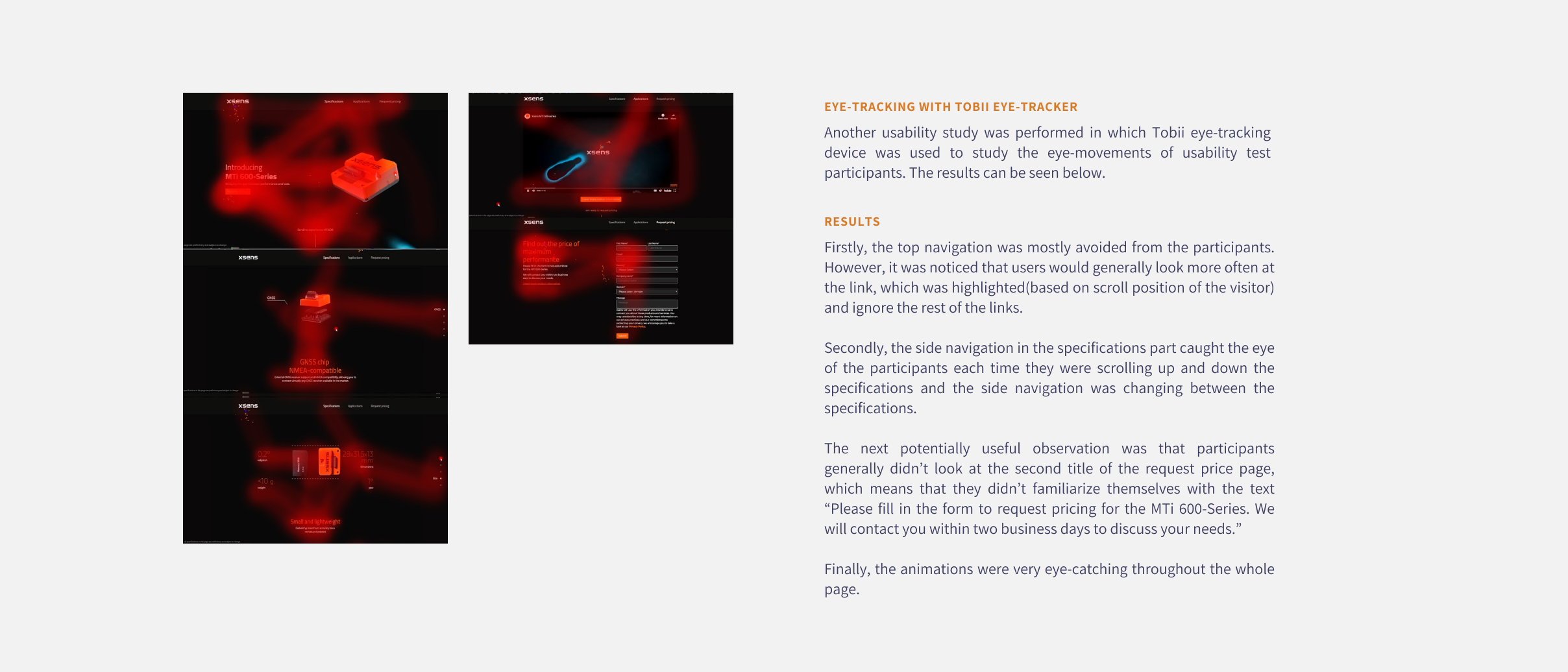
Tobii eye tracker was used in another set of user tests in order to be find out which elements on the page attract the most attention and which are missed and see if we could use this information to optimise the page further in the future. A heatmap was generated based on the results.
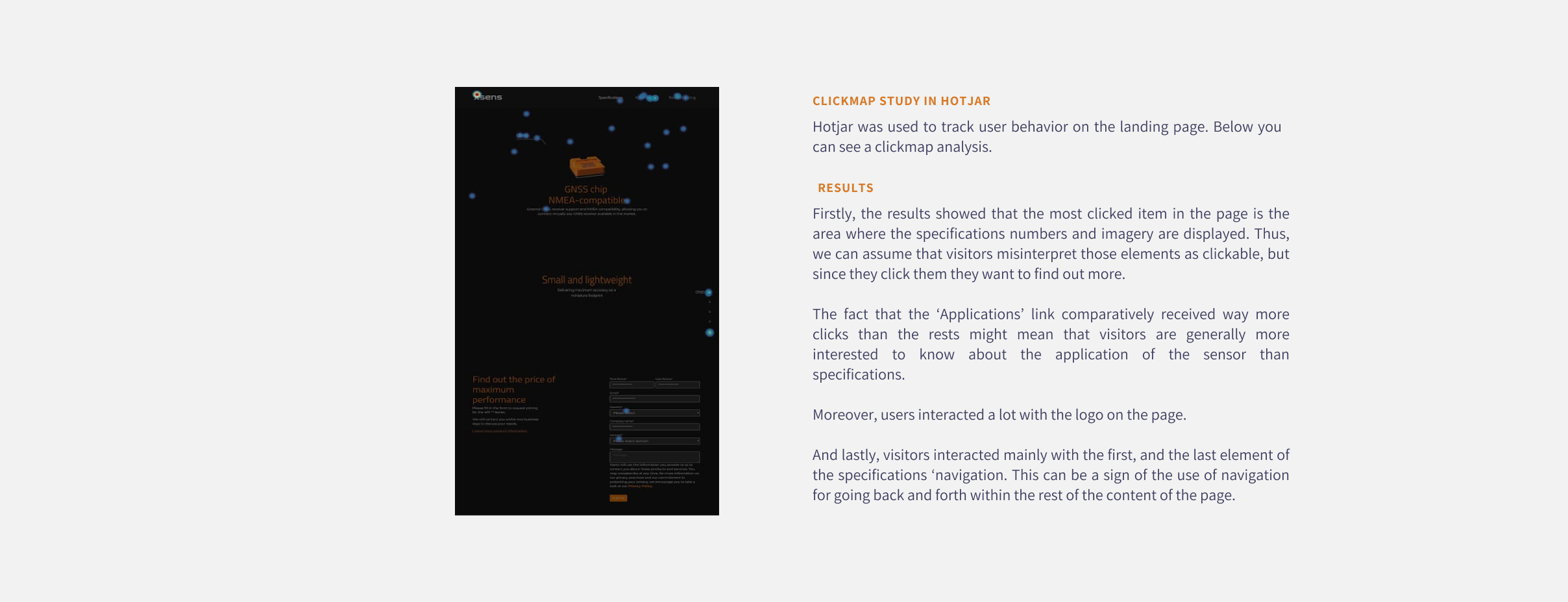
Moreover, a clickmap was extracted from Hotjar which showed us where do users clicked the most on the live page.
Usual scenario
Unsual scenario


Improvements were made based on the major issues found during the usability tests. Some are mentioned below.
