Let's say that Duolingo decided to launch a travel app where people could book a language trips to different countries to imerse themselves in different activities and learn the language from locals. What would the flow for booking a trip look like?
Design a flow which fits the target users needs and goals while sticking to Dualingo’s brand guidelines.

Within this project due to the short timeline, it was not possible to conduct user research therefore I have relied on my own experience as a traveller.
The project started with benchmarking with similar competitor products. A proto persona was defined as well as the ontology of the app ( the different categories of objects that will exist in it) and the user flow.
This was concluded with sketches and a prototype design.
One useful way of differentiating between the different explanation needs is based on the types of questions users might want to ask the model.
In the domain of context-aware computing, the following types of questions are defined:
Input, Output, What, Why, Why Not, How, What If, How to, and Certainty

Successful travel apps such as Airbnb, Couchsurfing and Skyscanner were explored and good user experience patterns were discovered.






A proto persona was created and the user flow of a traveller trying to book a place to stay and activities in the selected city.


Illustrations of Rotterdam hotspots to be used in promotional materials about living in Rotterdam.
Tools:
Illustrator
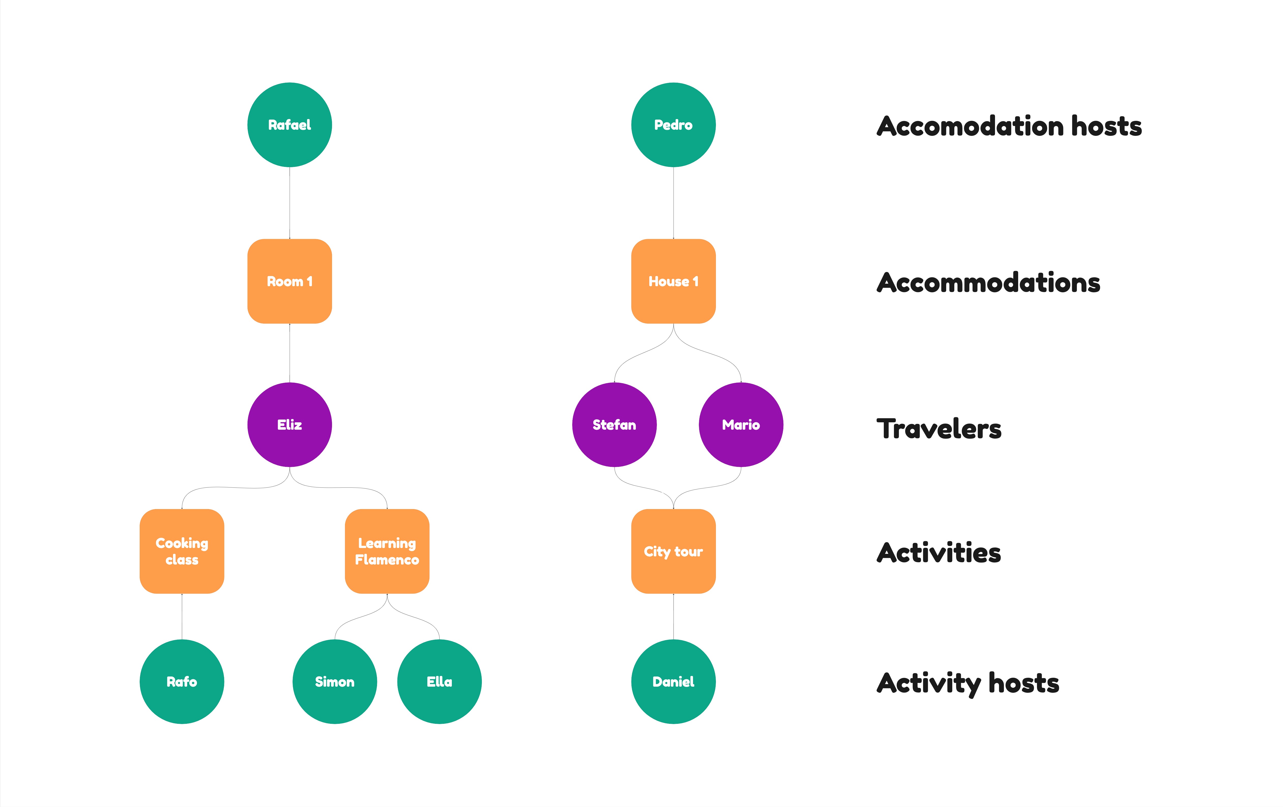
The Dualingo Travel app would include different type of object categories and to ensure a full understanding of the future app they were visualised first. There were activities, activity hosts, accommodations and accommodation hosts.

At this stage the steps within the user flow were visualised in the form of sketches.


Low-fi prototype
The Dualingo Travel app would include different type of object categories and to ensure a full understanding of the future app they were visualised first. There were activities, activity hosts, accommodations and accommodation hosts.

Improvements
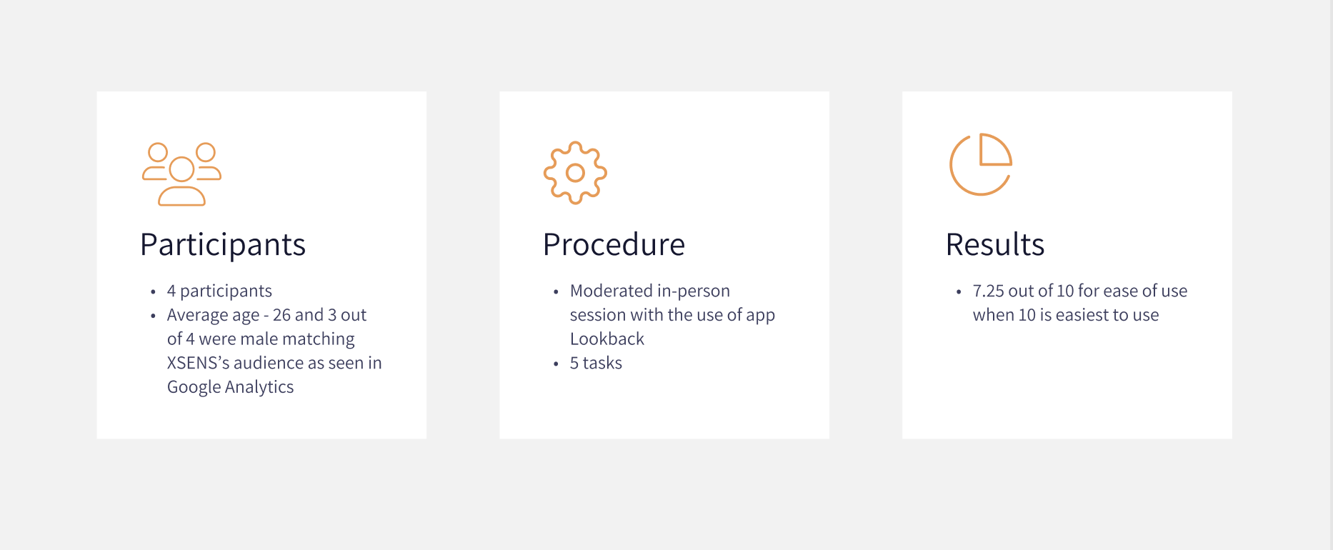
4 usability tests were conducted to evaluate the first prototype’s usability and clarity.
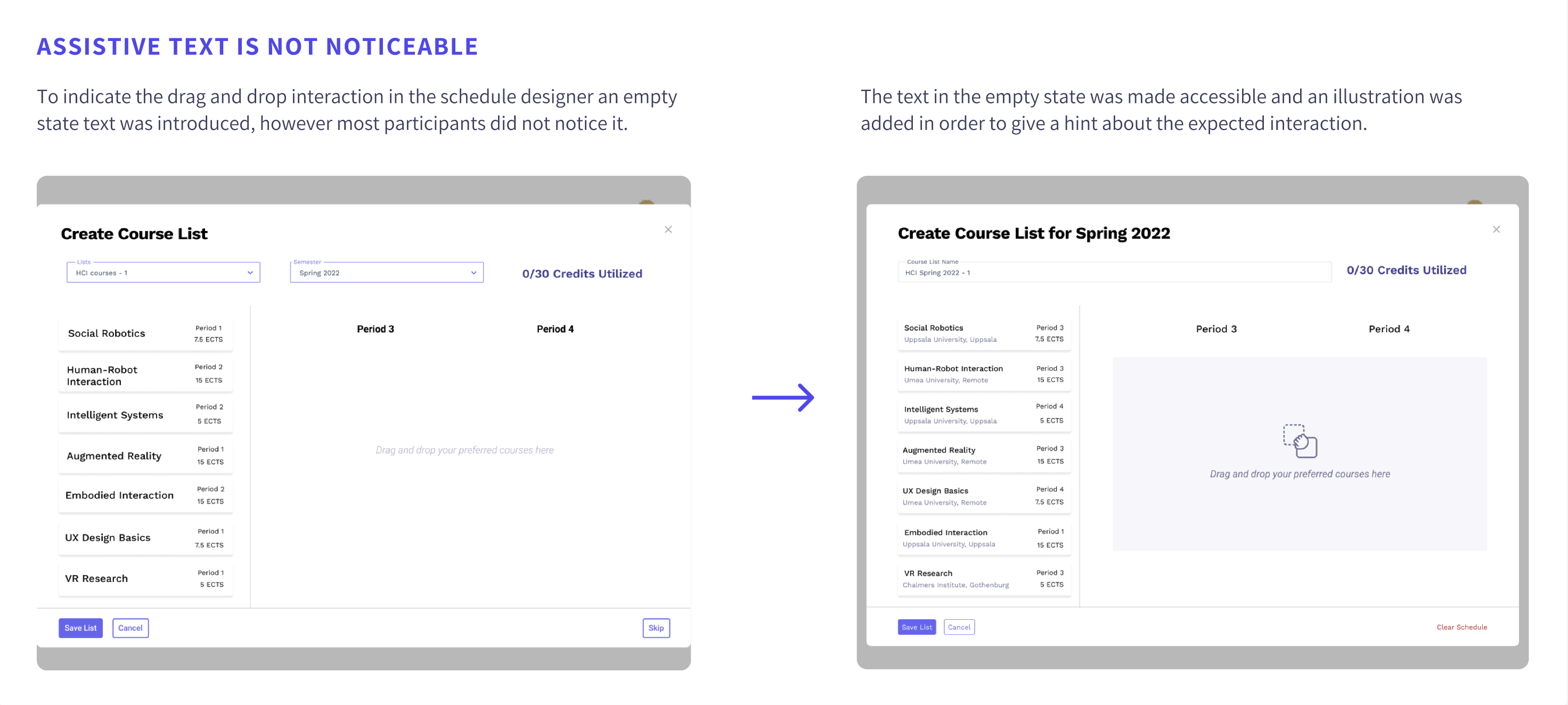
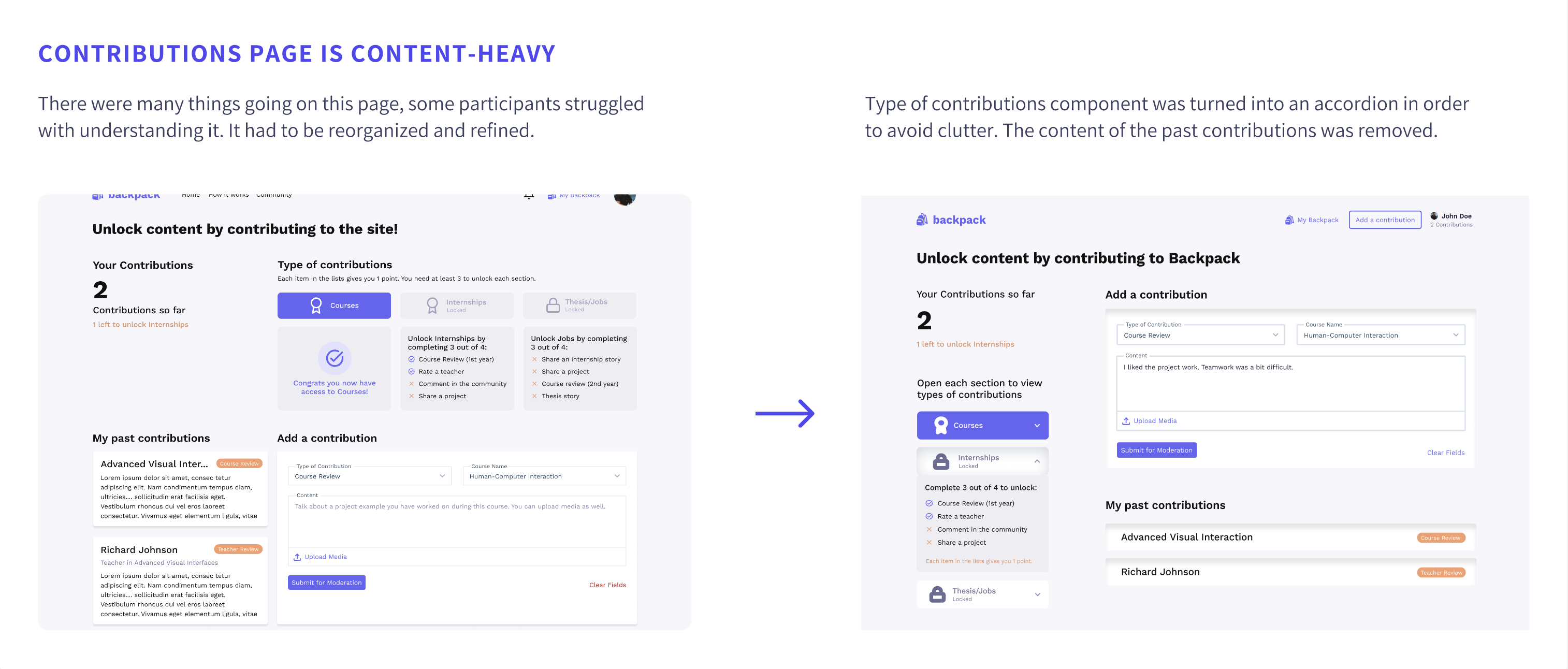
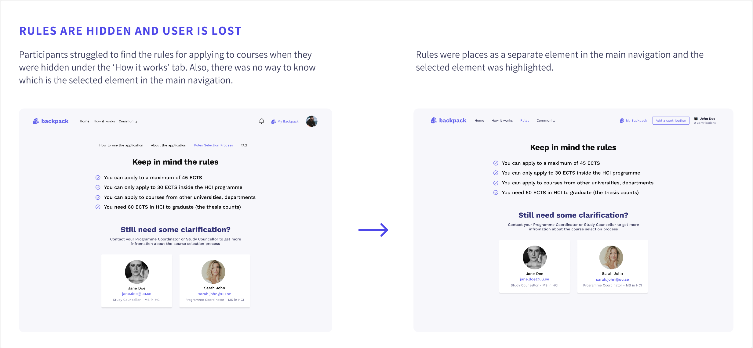
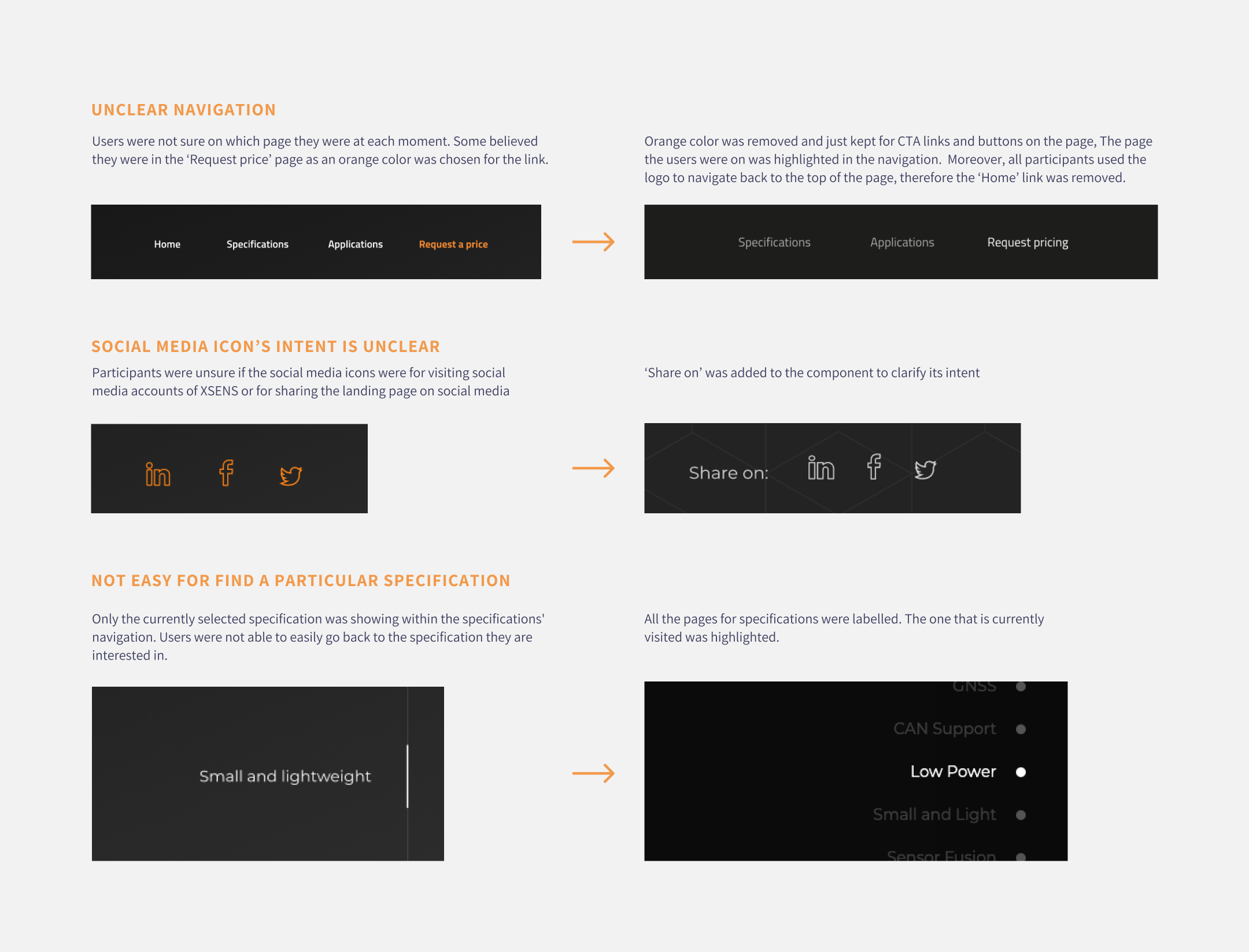
Afterwards, the prototype was improved based on the findings. Some of the issues spotted during the usability tests are described below together with their improvements.


A simple design system was created to ensure consistency and speed up the high-fidelity design process.
You can access the design system from here.
The design was created in Figma. You can access it from this link. Or watch the video below.
Once the web page was live click map and heatmap analysis could be made as all animations were now running smoothly and all interactions worked as expected.
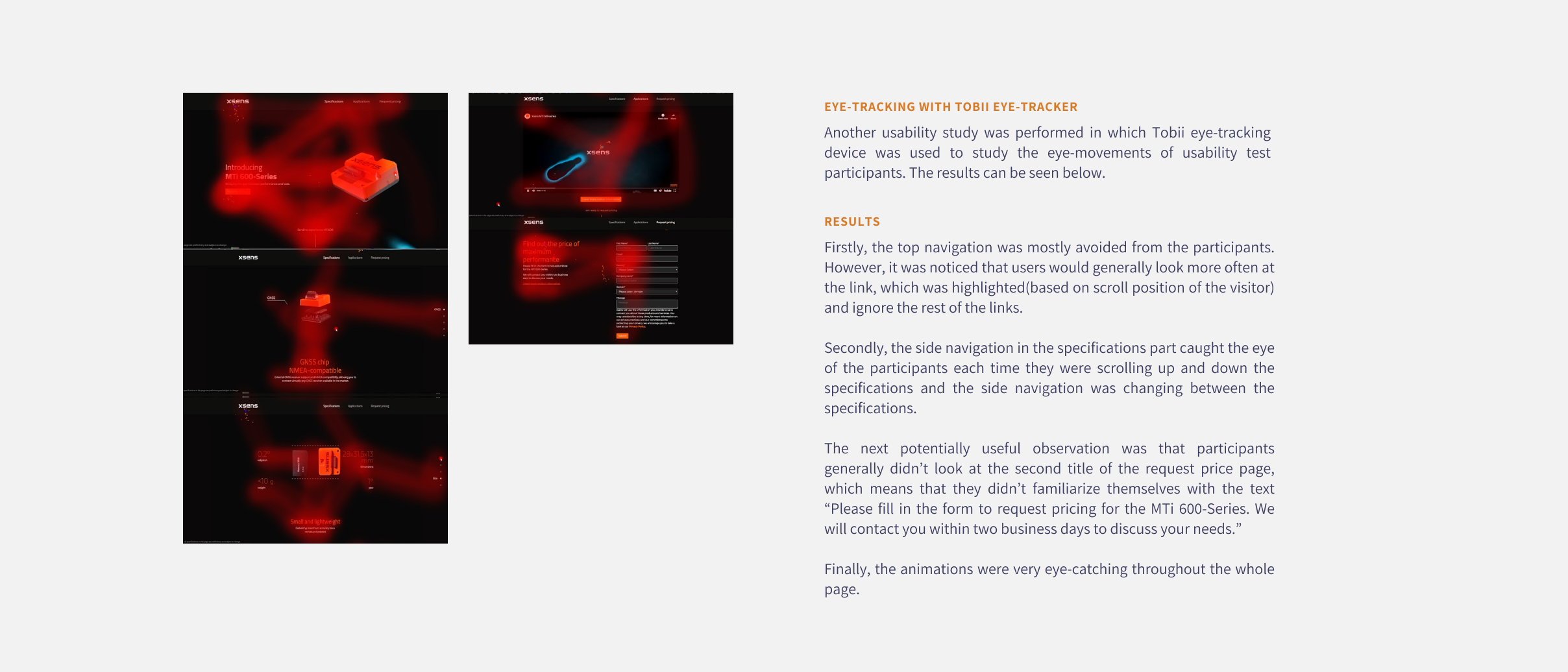
Tobii eye tracker was used in another set of user tests in order to be find out which elements on the page attract the most attention and which are missed and see if we could use this information to optimise the page further in the future. A heatmap was generated based on the results.
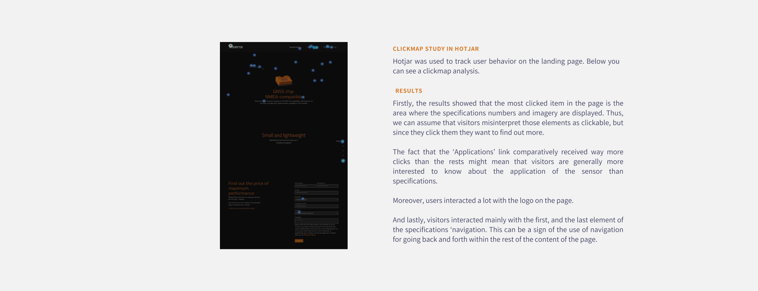
Moreover, a clickmap was extracted from Hotjar which showed us where do users clicked the most on the live page.
Usual scenario
Unsual scenario

Improvements were made based on the major issues found during the usability tests. Some are mentioned below.
