Backpack - redesign of a student portal | Uppsala University
Uppsala University students from the Social Science Department were not satisfied with the process of selecting and applying for elective courses.
The courses were sent to students just one month before the application deadline. Students had to navigate a complex nation-wide application portal for course selection.
Additionally, course presentations lacked clarity, leading to student frustration. The challenge was to streamline course selection, enhance efficiency, and ultimately improve student satisfaction.
.png)
Design a new student portal to improve student satisfaction in selecting courses.

For this project a user-centered design methodology was followed. The focus was on understanding the whole context and this is why both students and teachers were interviewed as well the differnt type of students, who might have different needs. A system was designed based on our findings and tested and improved based on the tests.

One useful way of differentiating between the different explanation needs is based on the types of questions users might want to ask the model.
In the domain of context-aware computing, the following types of questions are defined:
Input, Output, What, Why, Why Not, How, What If, How to, and Certainty

Course administrators were interviews in order to understand the current course selection process better and why it was designed this way. Information from students on the other hand was collected with mixed methods - surveys, interviews and focus groups.


The results from the survey showed that students do not feel well informed during the course selection experience and they tend to seek additional resources for decision-making such as talking to seniors and classmates and contacting course teachers.
Moreover, the criteria students considered most important were career goals, relevancy and interest in the subject, while the difficulty of the course and the lecturer were not considered a priority. Three student personas were created based on the differences found among students. Some were ‘maximisers’ worried about not making the best choices about their studies and always going the extra mile, while others were ‘satisficers’ who chose on gut feeling.
Moreover, fee-paying status also distinctly separated student opinions. An inductive thematic analysis was performed on both the student and staff interviews. The most common themes that emerged can be seen in the images below.


The MoSCoW method was used to prioritize the extensive list of user requirements derived during the data gathering phase.
Illustrations of Rotterdam hotspots to be used in promotional materials about living in Rotterdam.
Tools:
Illustrator
As the application had to include many different pages and functionalities before designing we decided to organize all the information we had to represent in a Sitemap. This was very valuable for the low-fidelity prototype design, which included all pages of the sitemap.

When the team had a clear idea of the requirements, we had a face-to-face brainstorming session which resulted in many ideas of how to solve the students' problems and many whiteboard sketches. At this stage, we also started thinking about the site map.


Low-fi prototype
As the application had to include many different pages and functionalities before designing we decided to organize all the information we had to represent in a Sitemap. This was very valuable for the low-fidelity prototype design, which included all pages of the sitemap.


Improvements
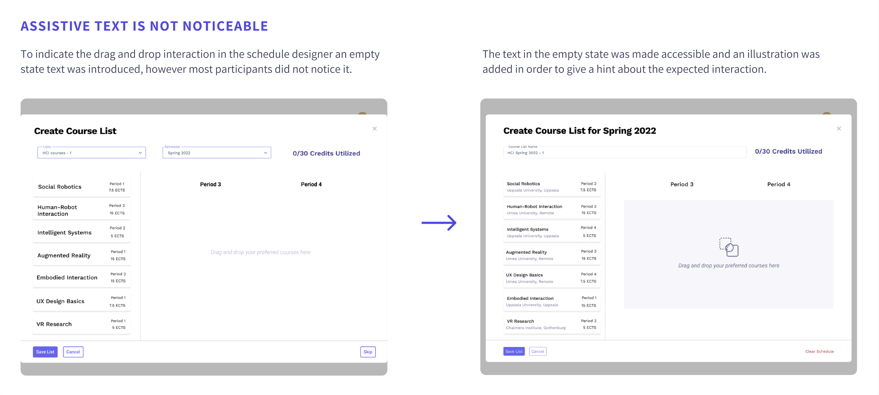
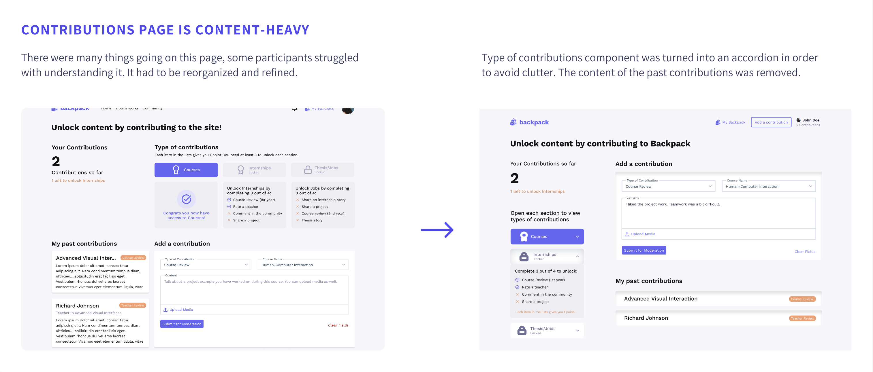
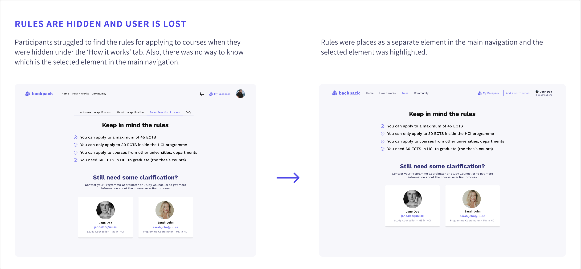
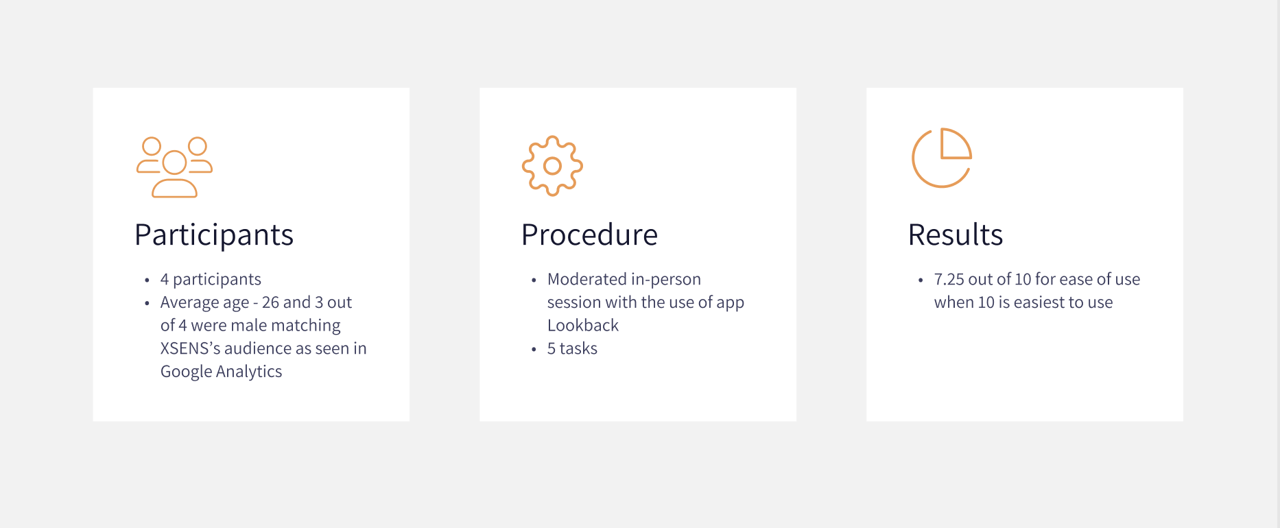
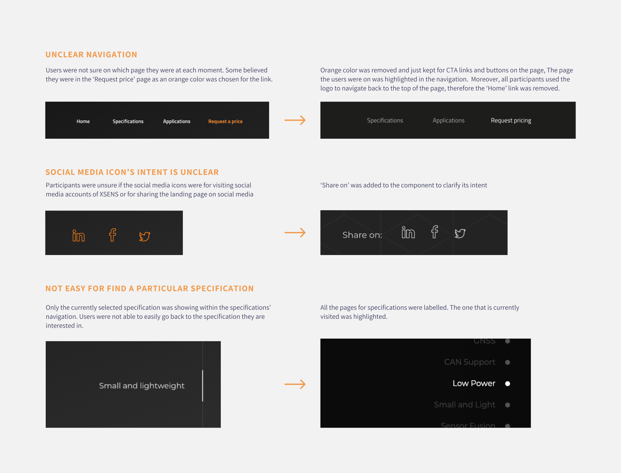
4 usability tests were conducted to evaluate the first prototype’s usability and clarity.
Afterwards, the prototype was improved based on the findings. Some of the issues spotted during the usability tests are described below together with their improvements.
A simple design system was created to ensure consistency and speed up the high-fidelity design process.
You can access the design system from here.
.png)
The high-fidelity design was created in Figma. It showcased all the features of the app. You can interact with the prototype here
Once the web page was live click map and heatmap analysis could be made as all animations were now running smoothly and all interactions worked as expected.
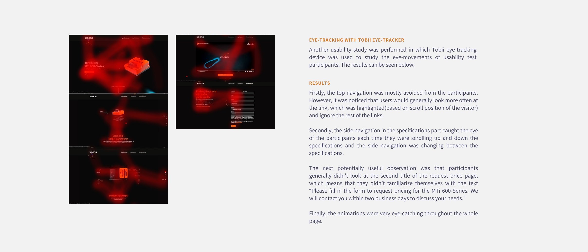
Tobii eye tracker was used in another set of user tests in order to be find out which elements on the page attract the most attention and which are missed and see if we could use this information to optimise the page further in the future. A heatmap was generated based on the results.
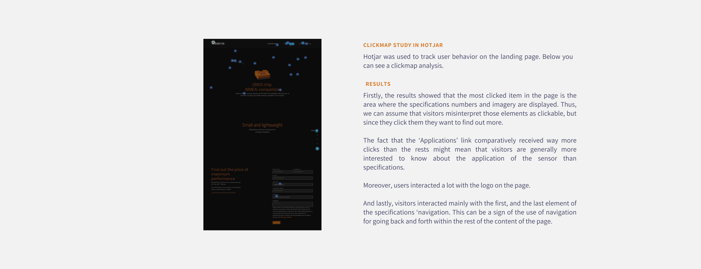
Moreover, a clickmap was extracted from Hotjar which showed us where do users clicked the most on the live page.
Usual scenario
Unsual scenario
5 usability tests were conducted with students to evaluate the prototype’s usability and clarity. The full usability report can be seen here.

Improvements were made based on the major issues found during the usability tests. Some are mentioned below.